
The Plus-Only Method
Arctic+ Mineral Water is a vitamin water brand (part of Ustronianka Group) focused on hydration with extra added value. My task was to propose fresh way to communicate a product designed around clarity, freshness, and a positives-only philosophy.
Key Objectives
Balance clarity of message with fresh approach.
Show accessability, it's your companion in healthy hydration every day.
Elements and color palette deeply rooted in products branding.
Reels must be eregnetic, just like you after a sip of this water.
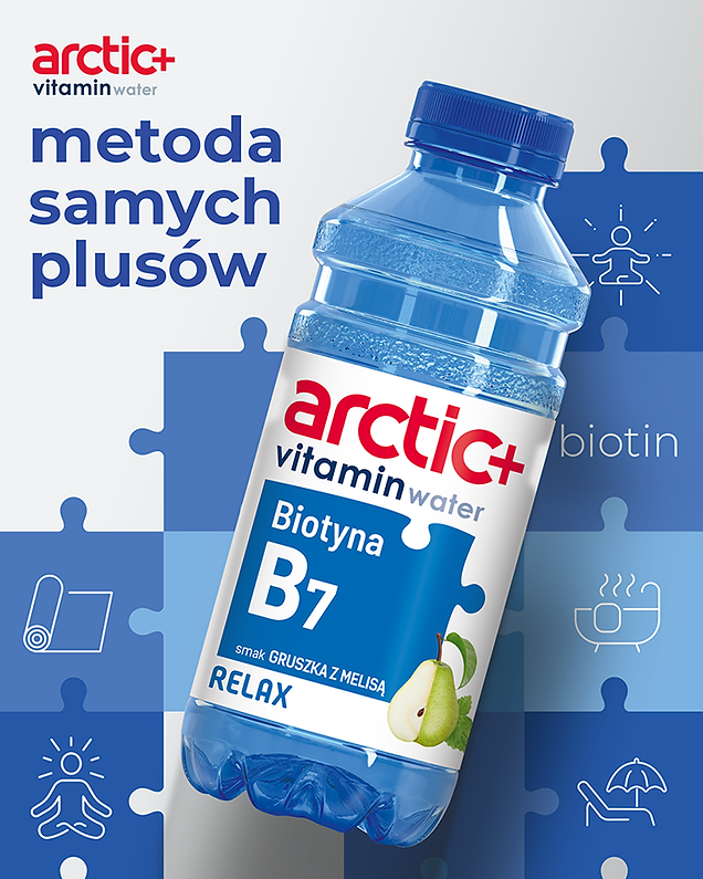
Execution
The Arctic+ vitamin water campaign was designed around a modular visual system inspired by the idea of a “positives-only” method. Bold color coding, puzzle-like graphic elements, and expressive photography were used to clearly communicate functional benefits such as relaxation, focus, and immunity across product variants.
The consistent layout ensures strong brand recognition, while the flexible system allows each variant to maintain its own character. The result is a cohesive, modern campaign that effectively connects product functionality with everyday lifestyle moments.
Next to the static assets, were created dynamic reels highlighting nature of product.


